A closer look
The idea and the design
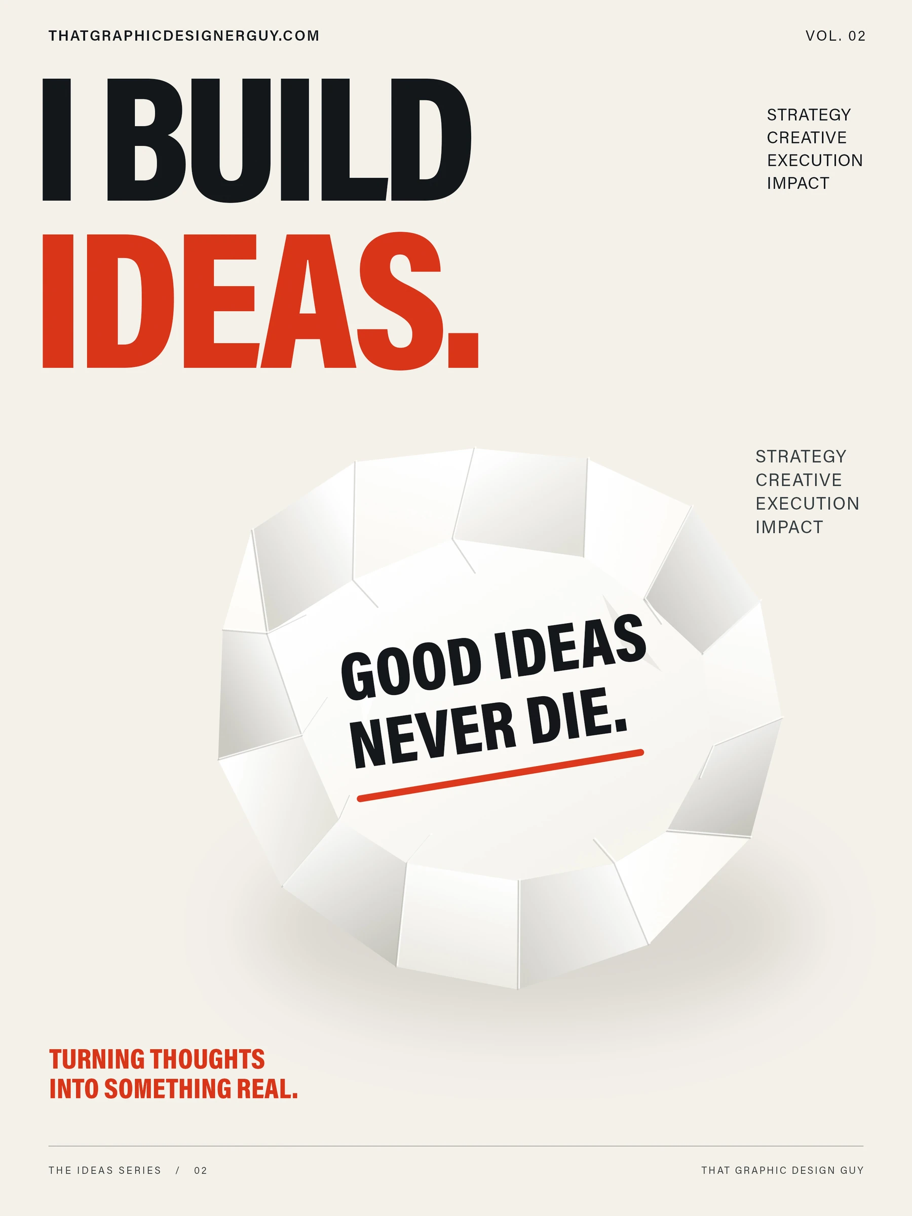
Persistence is the second numbered piece in the I Build Ideas poster series. A folded paper form carries the statement “Good ideas never die.” The poster treats an idea as something that can be reshaped and brought back into use, with the studio identity kept visible at the top and bottom.
Composition and presentation
Black and red typography sit on a warm ivory field. The paper form makes a compact central focal point beneath the larger headline. Repeating the red accent in the underline and the closing line connects the image to the message without adding another competing color.
How does the poster communicate persistence?
The message is carried by the words on the paper and the physical suggestion of a sheet being unfolded. The red underline emphasizes the statement, while the surrounding space gives it a clear place in the composition.
How does it relate to the other posters?
Persistence shares the I Build Ideas headline and numbered-series treatment with Further. Each piece keeps a recognizable typographic identity while changing the central image, palette and supporting message.